everyone can be king 77 here from the AC syndicate team here with a much-awaited video from all of you guys been getting a lot of requests for this video but finally here to do a full review of the Samsung Galaxy Nexus from sprint definitely getting a lot of people saying when’s this going to come out while I finally one ended a bunch of testing and ready to go but before I do jump into it and you want to remind you guys a lot of people have been asking hey TV where can I go on find and buy and sell my used android device a lot of people saying where can I go find some cheap used android devices definitely be sure to check out swap com I mentioned it in previous videos a lot of people must forgot because I’ve been in a lot of questions asking taking your mind view which site that was but swapping calm you can buy and sell your gently Android used devices also if you want to sell them you don’t have to deal with any ebay fees or anything like that it’s very easy so I will post a link in the description of the video to swap a.com you definitely don’t want to check that out but anyways we are ready to go go ahead and get into the review
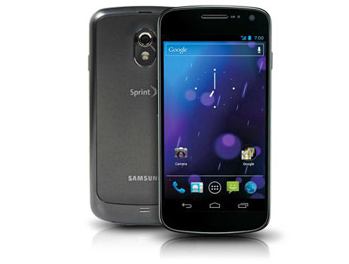
of the spring Galaxy Nexus this is part 1 i’m going to go ahead and make it a two part video as it probably will get extensive as i like to jump into detail with certain things but let’s go ahead and get into it alright so here is the device itself the Sprint Galaxy Nexus right away you will notice the very big 4.6 5-inch display 4.4 65 inch screen which is quite large for device obviously they’re getting bigger and bigger of course so it also you will notice a nice curved design to it it would does have a bit of a curve to it right away when I first got it I did remind me of a bigger nexus s 4g and I mean they do look similar there’s obviously a little bit of differences obviously with a bigger screen and such but it definitely did remind me of the design of a nexus s 4g soap you’ve seen a nexus s you definitely will know the design especially the curve design to it I do like that a lot it gives a nice feel it’s very very sturdy very well built obviously with the 4.6 5-inch screen you get on the screen space as well but on the left side here we’ve got two volume rockers up and down of course so that’s it for the left side on the right side here you’ve got your power
button along with these three little dots here which would be for the dock in case you were wondering although I do have to say I really am pleased with the position of the buttons on this phone in regards to the volume buttons being right where my middle finger is and the power button being in the perfect spot for my thumb Samsung does a nice job I definitely prefer the power button being right here and the volume buttons being
right here it’s the perfect position for these buttons I don’t know if that matters to you guys but it definitely matters to me I definitely like power button to be right there the volume buttons to be right there it’s a perfect design with these with these buttons and at the bottom of the device as you can see you have the 3.5 millimeter headphone jack along with the slot for your microSD cable along with the microphone actually so you see that will hold there that would be the microphone this is just a sticker over here on the back here as you can see of the speaker obviously this little devices are going to come with your phone it’s a flag grip I have on there which pretty much always like to have with all the bigger smartphones or pretty much any phone lately anyway you have a nice design on the back actually I do really like the backplate the black backplate feels nice it’s it definitely has texture to it but it’s also got a soft feel to it I actually was at my buddy Tim’s house and he has a unlocked Galaxy Nexus and the back plate is different the unlocked Galaxy Nexus is back plate is actually a
little more rough and doesn’t have a soft faux feel as this sprint one so I’m actually very pleased that we got the softer plate as I prefer it a little more it feels very nice to touch of course as sprint right there you’ve got a 5 megapixel camera right there with an LED flash which I will get to in a while as i said we get a nice speaker right there down at the bottom but that’s about it for design on the sides and such up at the top you’ve got your other speaker along with the sensors there and a front-facing camera 1.3 megapixel front-facing camera there to take pictures do video chat all that good stuff and also down at the bottom here is actually an LED light notification light I will go ahead and show you guys that now alright so i just received a text message that I I sent so it should go ahead and blink letting me know I do have a notification right there so as you can see that’s very cool i do like it it looks very nice looks very nice that is down there right there once more so there you have it there nice notification light going on but overall hardware wise i do like the feel of it it feels nice it is i mean it i wouldn’t say it’s light it’s it’s definitely a sturdy device well-built as well not you don’t have that plastic you feel to it it definitely feels like it is well made so you don’t have to worry about that speaker
wise i mean when you’re on speakerphone with cause or playing music it’s it’s okay nothing amazing but i mean it does its job it definitely sounds pretty good so speaker wise nothing to worry about there but let’s go ahead and jump into it alright so right away we have the stock lock screen as you can see right here when you press the unlock button you have the option to go to camera straight to camera or to unlock the device so you have two options there right away running Ice Cream Sandwich obviously the latest Android version which is obviously great you’ll also notice down at the bottom you do not have capacitive buttons you’ve actually on-screen buttons back home and basically your recent apps running apps list there in regards to this I mean they’re they’re okay they do take a little while to get used to the on-screen buttons so don’t be frustrated right away you might accidentally press them whether you’re typing or trying to select a nap down on the dock don’t be frustrated if you do accidentally press them because that pretty much does go away as you get used to it so it takes probably about a few days to actually get used to having these down here as a post capacitive buttons but overall I do like the on-screen buttons it just took a little while used to at first I didn’t but also I what I don’t like is how there’s no menu button I’ll get to that in a bit but there definitely needs to be a menu button you it makes you think that they kind of went away with the menu button but there still is definitely a need for a
menu button which I will get to in a little bit but of course we have the stock Ice Cream Sandwich launcher right here which gives you options to make folders as you can see you got a nice google folder there you can rename it by touching the name down at the bottom so we have a nice google folder there just kind of drop apps on one another as you can see i have a couple browsers down here too but overall five home screen options you’ll see there now you’ll also notice you got a nice ice cream sandwich blue color look to it so let’s go ahead and look up the the top here and we will basically see that we have a nice blue look to the clock is blue I battery icons blue my wife I kind of an signal bars are all blue I go ahead and swipe down here you’ll see you have different notifications what you can do with these notifications if you want to get rid of one of them you can just swipe it away so as you can see my gmail notification went away and I still have this notification here you have a quick settings button right there which you can jump to very quickly overall though it is semi-transparent you can see through it somewhat but not not completely obviously this dark tinted so sprint down at the bottom but you can also press as X to clear your notifications so anyways you see you got the date here you also have this little button here that will take you straight into the setting so you got a bit of a settings shortcut which is pretty nice to have when you want to get straight into your settings so you’ve got that option also of course this is the settings menu many different settings let’s go to
about phone first as you can see Galaxy Nexus android version 4.0 point for which is what I am running so obviously Sprint Galaxy Nexus there but overall you’ve got wireless and networks up at the top basically you got Wi-Fi Bluetooth data usage and more you can tap on Wi-Fi it will take you to your list of Wi-Fi ones you can turn it on or off just press it I also want to go to more real quick because i want to point something out obviously this is the first sprint LTE device that is kind of what they’re saying so basically what you want to do to kind of get that working you want to go to mobile networks and then you want to go to network mode under network mode you’ll see you preferred network mode LTE CDMA and cdma right now if obviously you can turn on LTE cma but it’s most likely not going to connect I mean right away it might not maybe in a week or two it they could flip the switch and turn on their their towers and it might but I highly recommend for now keeping it on cdma until the LTE networks come up but as you can see it does have LTE capabilities I’m very excited to see what that has in store for speeds why speed wise you’ve got sound settings of course of different volumes vibrating ring just basically standard Android sound settings same with this play as well brightness in regards to the brightness I have automatic brightness check the automatic brightness is kind of goofy I wouldn’t say it doesn’t work it’s can sometimes be a little laggy to kind of adjust to the lighting when I go
outside and I turn on my phone it does take a little while for the phone to recognize that there’s a lot of bright light and needs to switch to a brighter display so I wouldn’t say it doesn’t work it just kind of takes a while sometimes and it can be kind of goofy oh just kind of flicker I wouldn’t say flickr but get brighter and darker real quick so overall it is kind of kind of finicky I guess you could say storage just kind of let you know what’s on your storage and such internal storage you have about 29 gigs of space available they say 32 gigs but internal storage II obviously got to use some of it up for the system but so I mean 32 gigabyte internal storage no SD card slot as I know as I talked about with my design but there’s no external SD card which I don’t mind at all because 32 gigs is more than enough for me I probably need about a 20-25 gig device so i’m pretty set with 32 gigs I don’t mind not having that SD card but if it was a 16 gig device only i would definitely kind of be a little upset there was no microSD slot but as as I said it’s 32 gigs so you really don’t have to worry worry their battery life obviously you go into battery you got different settings i guess about battery life battery life is actually pretty good so I’ve really had no issues I haven’t charged this all day and it’s at forty percent discharging screen on time being about almost an hour so overall it is pretty good it’s not going to get you throughout the day I mean it’s nothing to really write home about it’s it’s not exactly amazing battery life or anything but it is better than pretty much most android phones but I
mean especially with the newer phones coming out usually battery life tends to be good but not always with all the vices I mean battery life is just okay it’s not going to get you completely through the day but it will definitely be a decent amount of time especially having the eighteen fifty milliamp hour battery it does have so I mean overall you’ve got a lot of power there with that battery and it does its job it’s definitely pretty good battery life I would have really no complaints about the battery life I mean especially because you’re pretty much always depending on your usage you’re you’re going to have to probably charge it at least once not all not very many devices can get you through an entire day without charging it anyways so anyways you have app settings you have accounts and sync location services which is GPS in regards to location services turning GPS on GPS works really well I’ve had absolutely no issues with locks I’ve waited for a rainy day and I got a lock right away so no issues there with GPS in case you are someone that uses it a lot you don’t have to worry about it failing on you it definitely did its job for me language and input keyboard settings you have doc settings date and time accessibility developer and up out phone again so there you have it in your settings
menu of course on your Android settings you have a lot of those customizations and such but something I do want to talk about would basically be that menu button issue that I was talking about so I definitely believe they should have left a menu button in these on-screen buttons for example let’s go ahead and go into this game hearts 2 car game I like to play you’ll notice right away it shows some three buttons down here on the right so I press it and basically that’s our menu button for this app what ice cream sandwich basically does is nice the I would think the app developer has to decide where they want that menu button to be and it’s different throughout any application so you’ll see it’s down here this is where I think they should have put it always they should have made a consistent menu button right down here but anyways let’s go ahead and go into the dialer so for example we go into the dialer you’ll see the dial pad right here and you’ll see a menu button is right here now so I mean overall you’ll sometimes get it up at the top you sometimes get it towards the bottom sometimes you’ll get it down here on the actual on-screen buttons but it’s very hard because you want to press the menu button and you’re like ah which app in my own where is it that again so it’s definitely a little issue that I think needs to be fixed they definitely need to include a menu button hopefully samsung or HTC will with their overlays as much as
I really don’t like their overlays hopefully they will include a menu button down there with the on-screen buttons that’s my little issue there with the menu button but anyways nice theming there though to the dialer you can swipe through call log contacts go through obviously it looks very nice search menu but that is it for part one of my review of the Galaxy Nexus you’re definitely going to want to check out part 2 I go over many many more things so be sure to watch that I’ll link to in the description of the video or somewhere near here but also be here to watch those videos linked in the description and go over many more things Galaxy Nexus related but yeah that’s about it for part one be sure to check out part 2 be sure to subscribe to me and follow me on various social media and thanks for watching part 1
Read More: How to Install the Blu Kuban ICS Rom on the Samsung Epic 4G Touch


